


Dark Website Design: How to Make It Work in 2026
September 22, 2013
Google Ranking Factors That Matter in 2026
October 30, 2013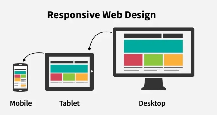
There was a time when a website was just a set of static pages built for a desktop screen — and if it looked broken on your phone, oh well. That era is long gone. Today people reach the web from phones, tablets, laptops, and everything in between, and a site has to look and work well on all of them. That’s exactly what responsive web design delivers.
What responsive web design is
Responsive web design is an approach that lets a single website automatically adapt its layout to whatever screen it’s viewed on. Instead of building separate sites for desktop and mobile, you build one that fluidly reshapes itself — resizing, rearranging, and reflowing content so it’s easy to read and use everywhere. The goal is a great experience with no pinching, zooming, or sideways scrolling, whether the visitor is on a 27-inch monitor or a phone.
Why it matters more than ever
This isn’t a nice-to-have anymore — it’s the baseline expectation, for two big reasons:
- Most of your visitors are on mobile. If your site is hard to use on a phone, you’re frustrating the majority of your audience and losing leads and sales before anyone reads a word.
- Google evaluates the mobile version of your site first (this is called mobile-first indexing). A site that isn’t responsive is at a real disadvantage in search — and how fast and stable it feels on mobile feeds directly into Core Web Vitals, which are genuine SEO ranking factors.
In short: responsive design is where good user experience and good SEO overlap. A site that adapts well ranks better and converts better.
How it works
You don’t need to be a developer to understand the fundamentals. Responsive design rests on three building blocks, usually built “mobile-first” (designing for the small screen first, then scaling up):
- Fluid, flexible grids. Instead of fixed pixel widths, layouts use relative units and modern CSS tools (like flexbox and CSS grid) so the structure stretches and rearranges to fit any screen.
- Flexible images and media. Images scale in proportion with the layout so they never overflow their container or force horizontal scrolling.
- Media queries. These let the site apply different styling at different screen sizes — for example, collapsing a three-column desktop layout into a single stacked column on a phone.
Together, these let one website present itself cleanly across virtually any device and resolution.
What good responsive design looks like
You don’t need to read code to judge whether a site is responsive — just pull it up on your phone and look for these signs of a job done well:
- Text is readable without zooming in.
- Buttons and links are big enough to tap easily with a thumb.
- Images scale to fit the screen and stay crisp.
- There’s no horizontal scrolling to see the full page.
- Navigation adapts sensibly (often into a “hamburger” menu on mobile).
- The page loads quickly and doesn’t jump around as it loads.
If a site fails those tests on your phone, it’s costing its owner visitors — and rankings.
The bottom line
With most web traffic now coming from mobile devices and Google indexing the mobile version of your site first, responsive web design isn’t optional — it’s the standard every professional site should meet. Done right, it delivers a clean experience to every visitor on every device while strengthening your search performance at the same time.
If you’re not sure your site measures up — or you know it doesn’t — that’s exactly what we do. Our web design work is responsive and fast by default, built to look great and convert on every screen. Reach out and we’ll take a look at where your site stands.