

The Best WordPress SEO Plugins for 2026
August 30, 2013
What Is Responsive Web Design? A 2026 Guide
October 30, 2013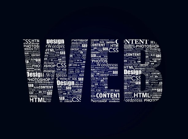
When it comes to website design, there’s always a balance to strike between artistry and usability. A dark design is tempting — it can look striking, modern, and elegant. And unlike a decade ago, dark design is no longer a niche gamble: with dark mode now built into phones, operating systems, and nearly every major app, plenty of users actively prefer a darker interface. Done well, a dark website can stand out and feel premium. Done carelessly, it tanks readability and drives people away. Here’s how to do it right.
When a dark design works
Dark design isn’t for every business, but it shines in the right context. It tends to work well for brands going for a sleek, premium, or high-tech feel, for portfolios and photography (dark backgrounds make images and video pop), and for entertainment, gaming, and creative industries. If your brand is warm, friendly, or trust-focused — think healthcare or family services — a light design usually serves you better. Start with what fits your audience and message, not just what looks cool.
Readability comes first
This is the rule that makes or breaks a dark site. Dark backgrounds are inherently harder to read if you don’t handle contrast carefully. A few essentials:
- Don’t use pure black or pure white. Pure white text on a pure black background causes eye strain and a shimmering “halation” effect. Use a very dark gray background (around #121212) and slightly off-white text instead — it’s far easier on the eyes.
- Hit real contrast targets. Make sure text meets accessibility contrast standards (WCAG) so it’s legible for everyone, including users with low vision.
- Ease off on heavy fonts. Thin, light-weight text can vibrate against a dark background — use a slightly heavier weight than you would on a light site.
Keep it open and uncluttered
There’s a heaviness people associate with dark colors, so a dark site packed with elements can feel claustrophobic, even oppressive. The fix is restraint: minimalist layouts, generous spacing, and only the elements that earn their place. Cut anything non-essential. That openness is what makes a dark design feel elegant rather than heavy.
Break up your text
Nobody wants to read a wall of text — least of all on a dark background, where it’s more tiring. Use short paragraphs, clear line breaks, sub-headings, and plenty of white space (well, “dark space”) to give the eye room to rest. Keep body-copy sections shorter than you would on a light site.
Offer a choice: light and dark
Here’s the most modern best practice, and the one the 2013 version of this advice couldn’t have given you: you often don’t have to choose. The strongest approach today is to offer both — a light/dark toggle, or a site that automatically respects the visitor’s device setting (via the prefers-color-scheme preference). That way, people who love dark mode get it, and those who read better on light get that. Letting the user decide is almost always better than forcing one experience on everyone.
Test it on real devices
Dark designs can look great on your monitor and fall apart on a phone in bright sunlight, or wash out on a low-quality screen. Always test your dark site across devices and lighting conditions, and confirm it stays fast and readable everywhere — mobile especially, since that’s the version Google evaluates first.
The bottom line
A dark website can be a genuinely powerful design choice in 2026 — striking, modern, and in tune with how many people already prefer to browse. The catch is that it demands more care than a light design: nail your contrast, keep it uncluttered, break up your text, and ideally let users choose. Get those right and a dark site can look stunning without costing you readers or conversions.
Not sure whether a dark design is right for your brand — or want it built properly? That’s what we do. Our web design work is built to look great and convert on every screen, light or dark. Reach out and we’ll help you find the right look for your business.